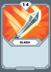
Ruby Metronome is currently on an indefinite hiatus. Before the project was put on hold, I worked primarily as a UI/UX designer and later 2D artist in the early stages of development for a verticle slice of the game. My focus was on helping to develop an intuitive battle UI that allowed the player to use card-based abilities in a rhythm game to defeat opponents while incentivizing the character to memorize their card's abilities and plan the strategy in advance. This included creating a look for the cards, icons and symbols of the game, and the logo.
Mock-ups/ Layout
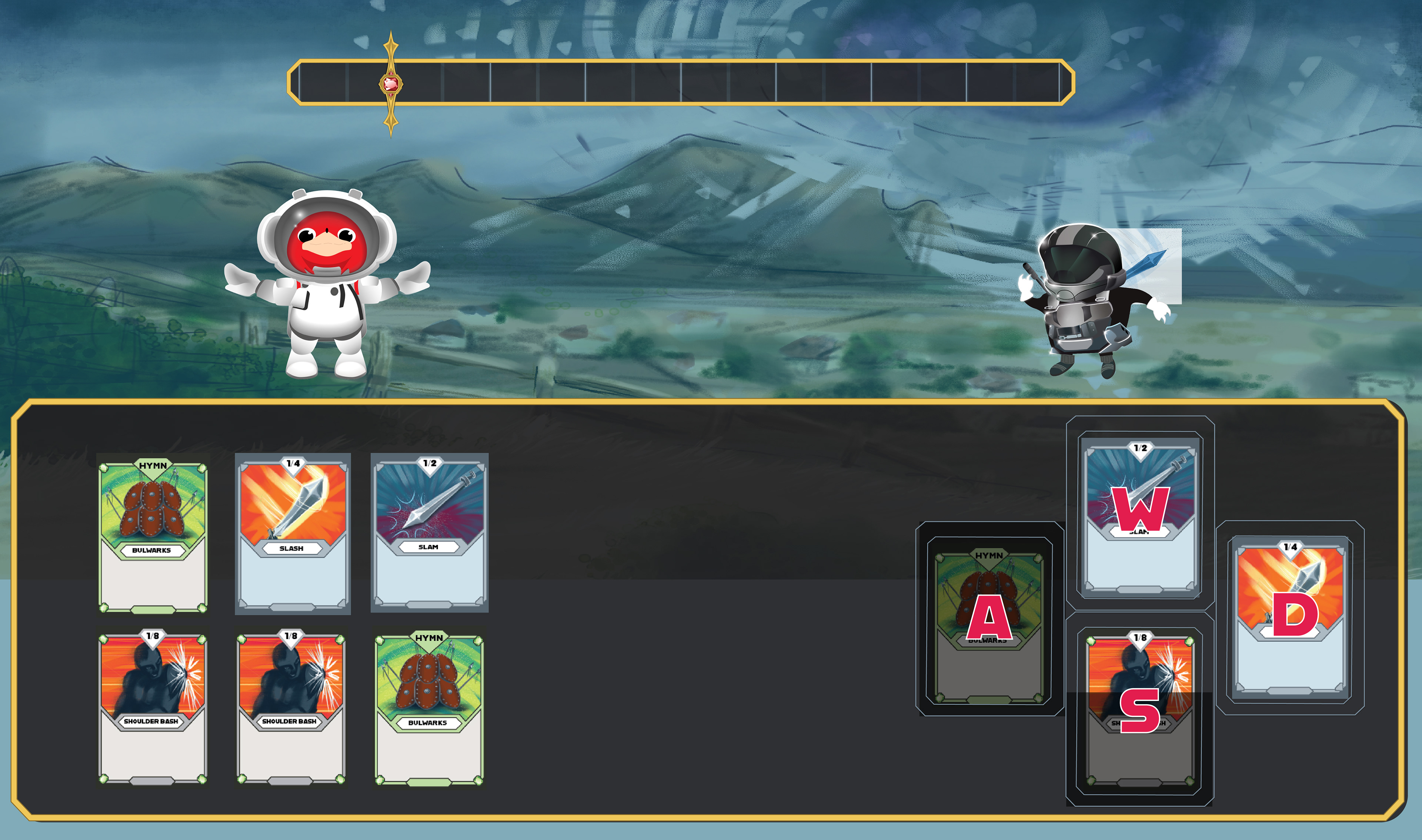
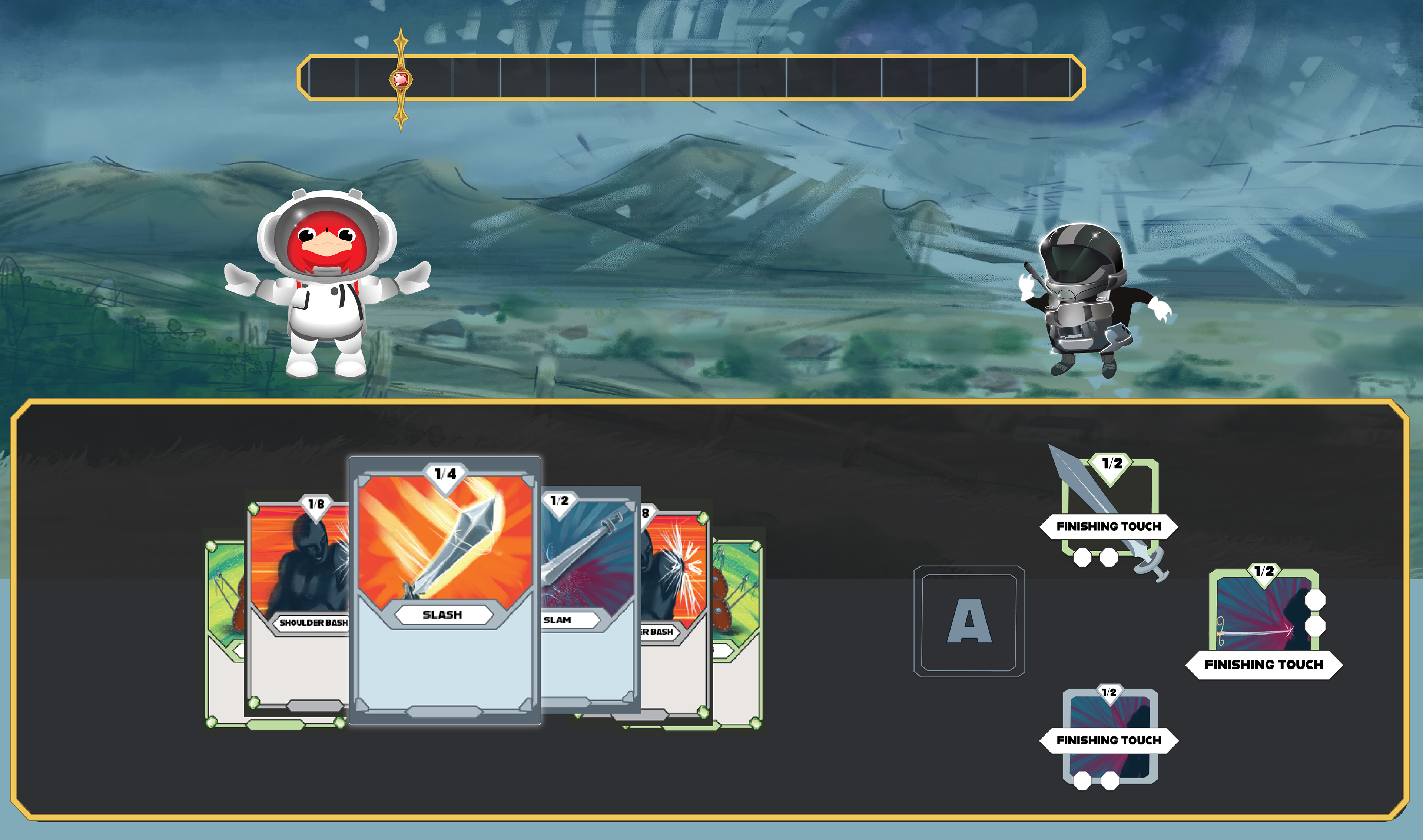
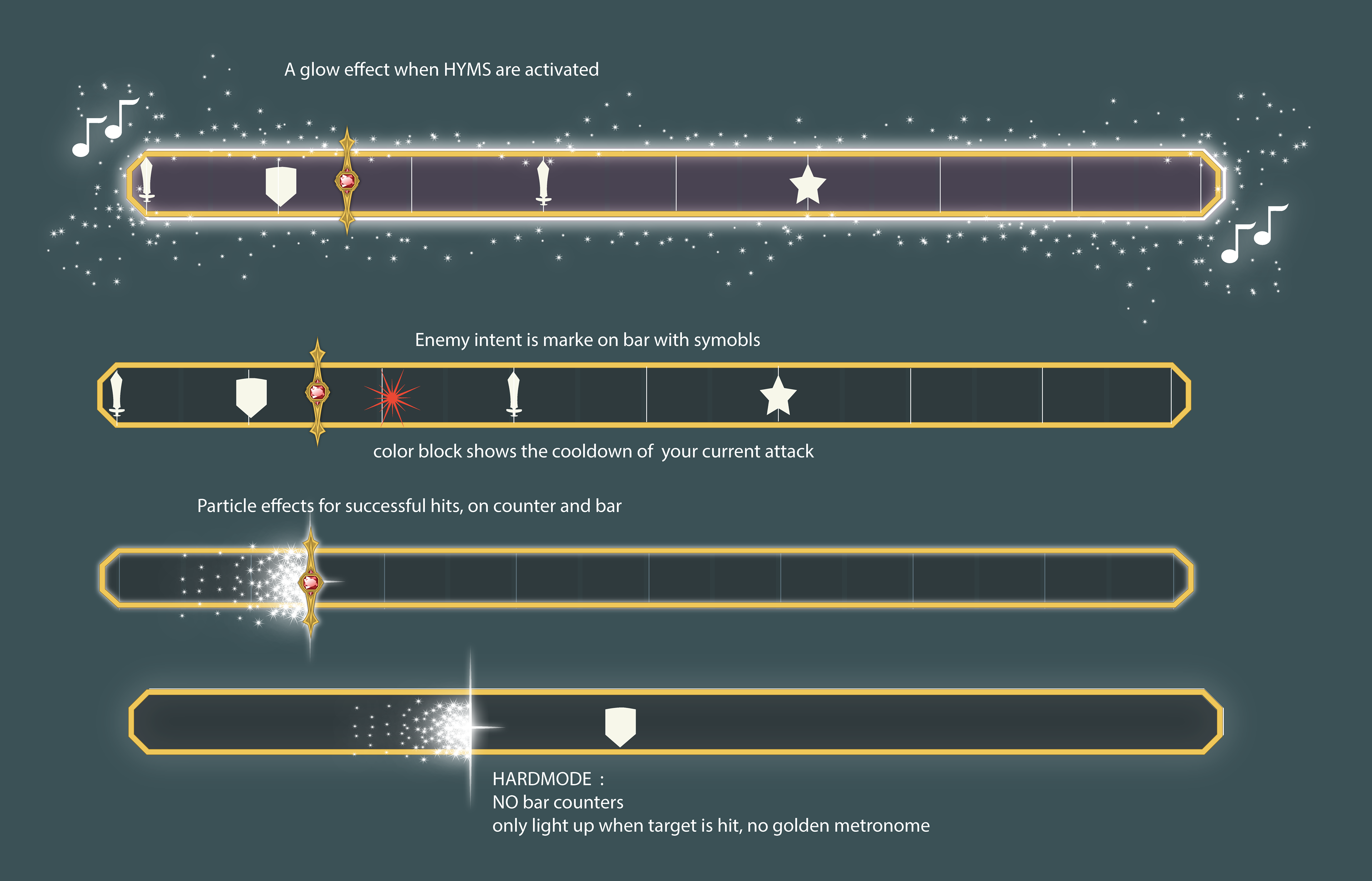
Variations on the layout of the Battle screen. Displays the active cards (your "hand"), the rhythm bar that enhances the effects of the card when successfully executed on time, the deck of cards available to swap between turns, and the battle scene itself.
The status of the active cards, their ability type, and the key used to execute the card is necessary to play the rhythm game.



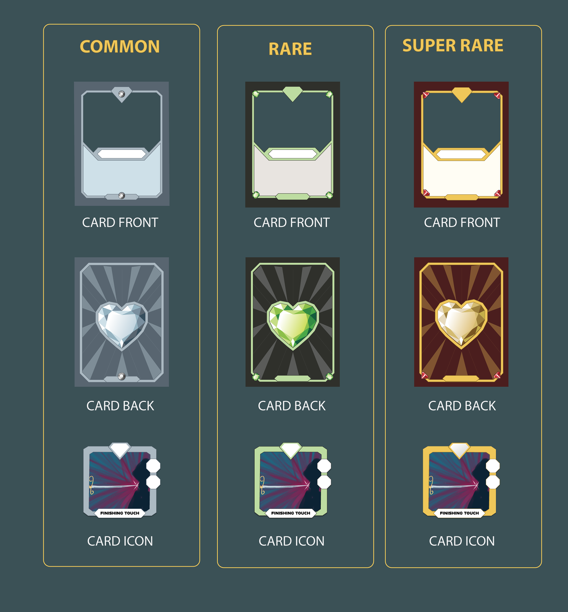
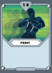
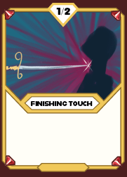
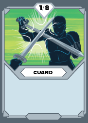
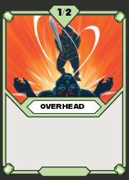
Deck Illustration Concepts
The basic layout and concept sketches to use as a reference and template for the final illustration artist.
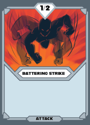
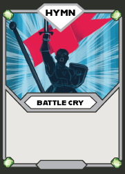
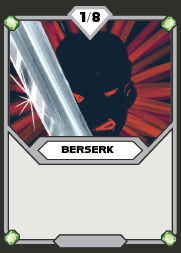
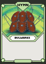
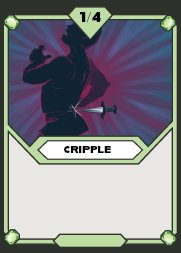

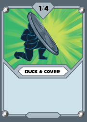
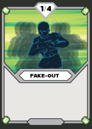


Visual Development: Environment
Later on, I moved to develop the "overworld" concept. This included the layout design and concepts for the map and the first-level dungeon.
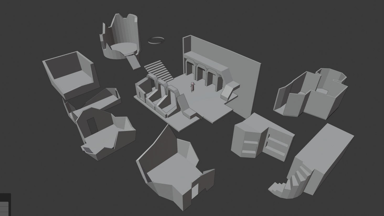
The approach was to block out complete dungeons in 3D, using a modular approach to create multiple levels that can be finished into cohesive 2D backgrounds. The player moves from level to level by selecting a new location on the map as they become available and exploring the dungeon of that location.
The approach was to block out complete dungeons in 3D, using a modular approach to create multiple levels that can be finished into cohesive 2D backgrounds. The player moves from level to level by selecting a new location on the map as they become available and exploring the dungeon of that location.
Map Concepts
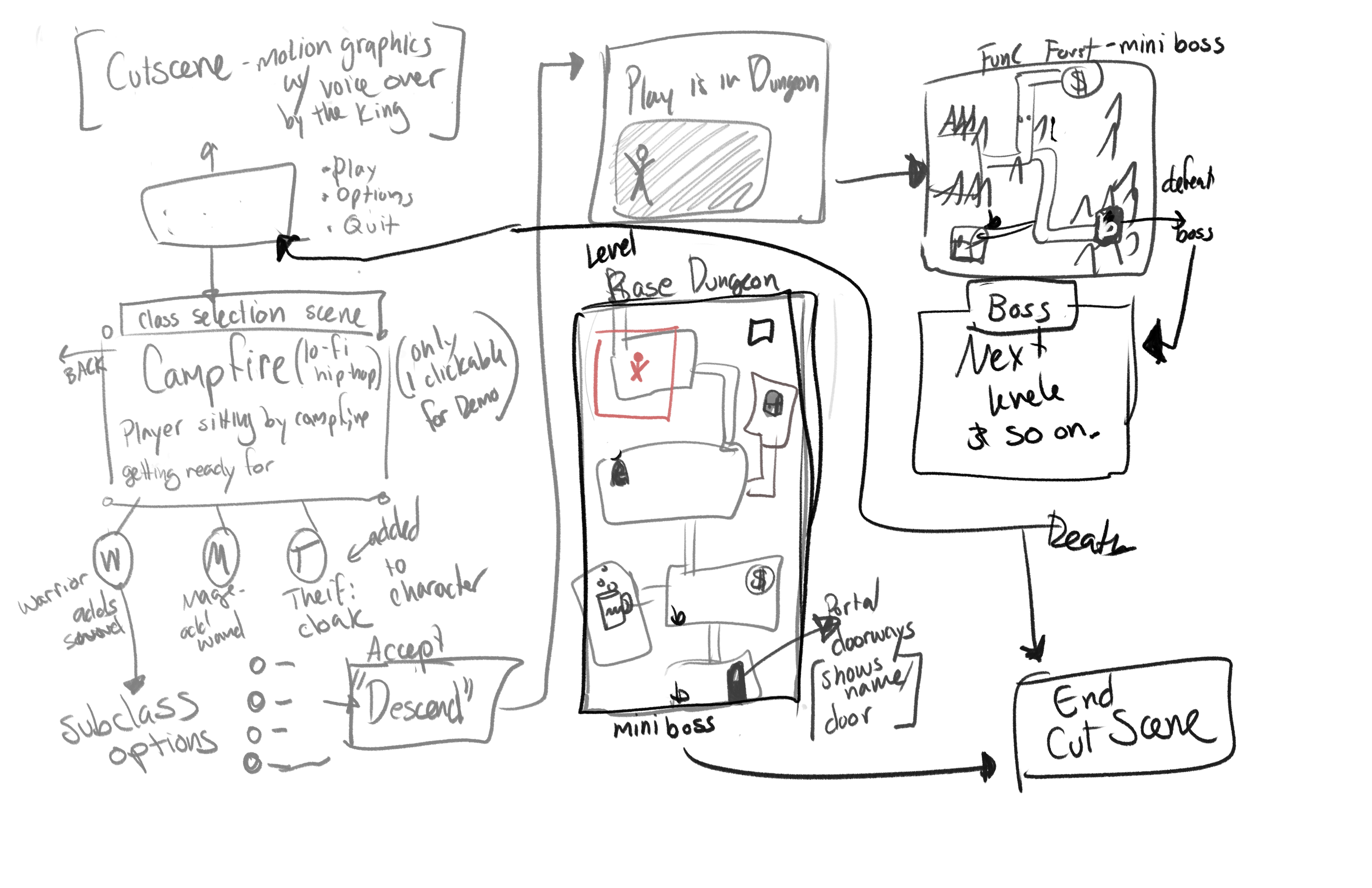
General Flow of the Verticle Slice
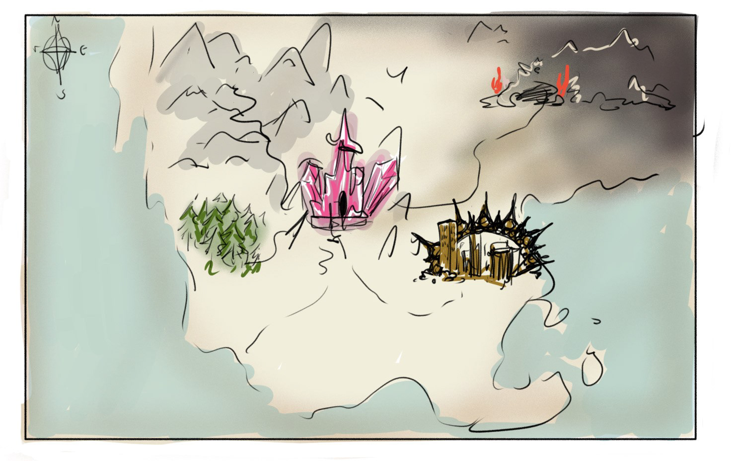
"Literal" Map view

Wide Shot View
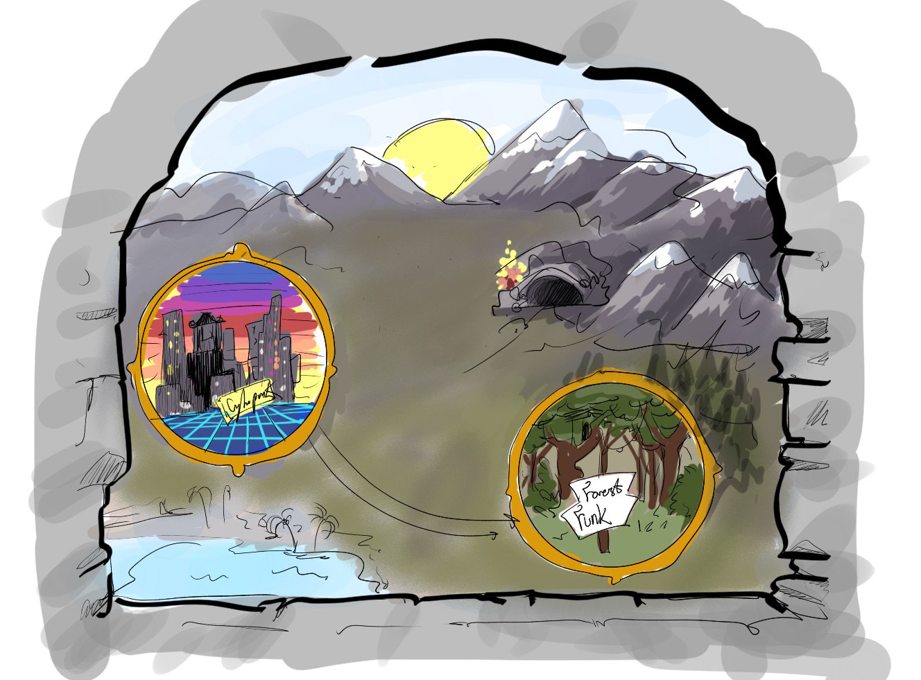
"Out of the Tower Window" View
Dungeon Concepts
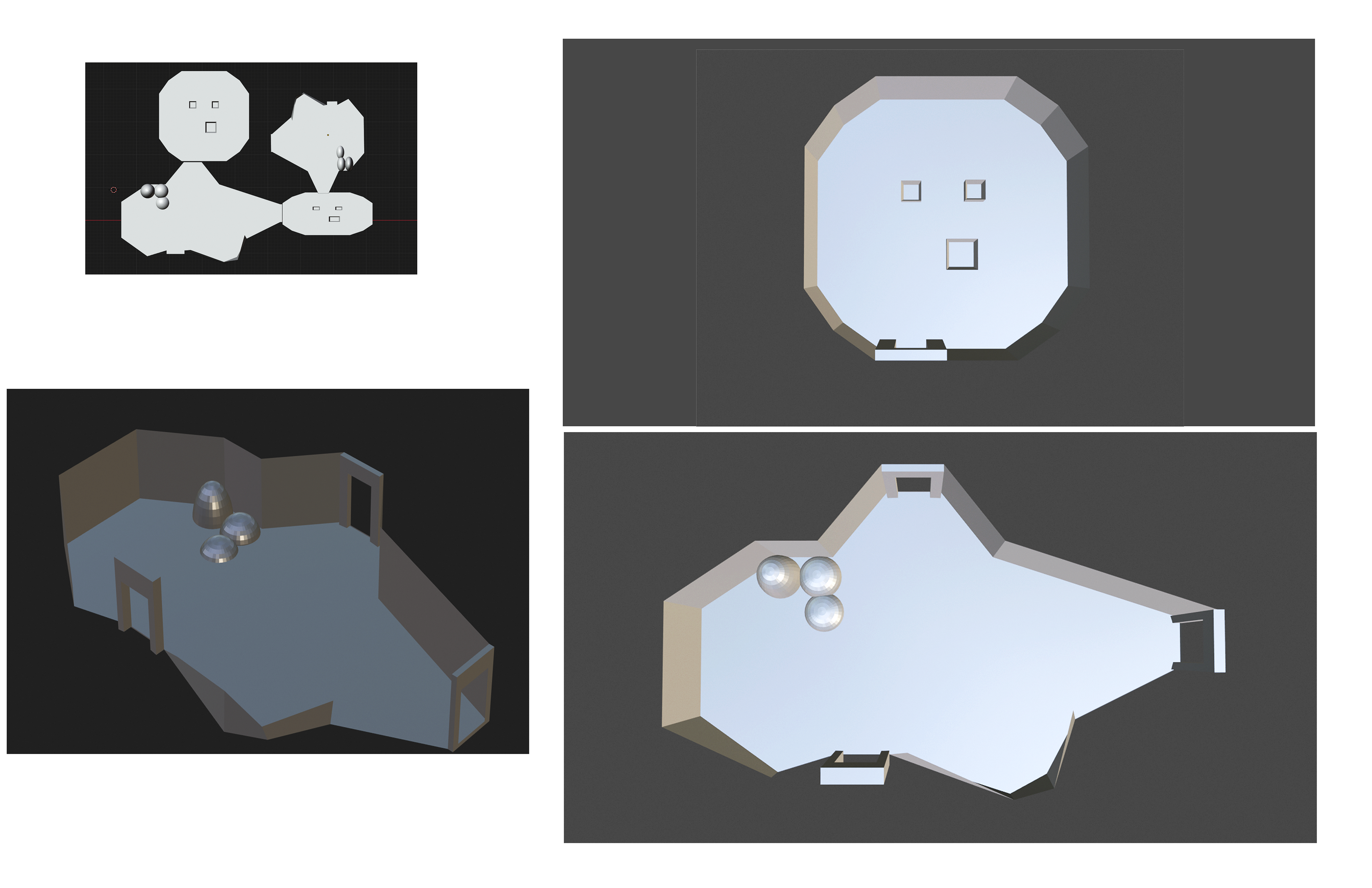
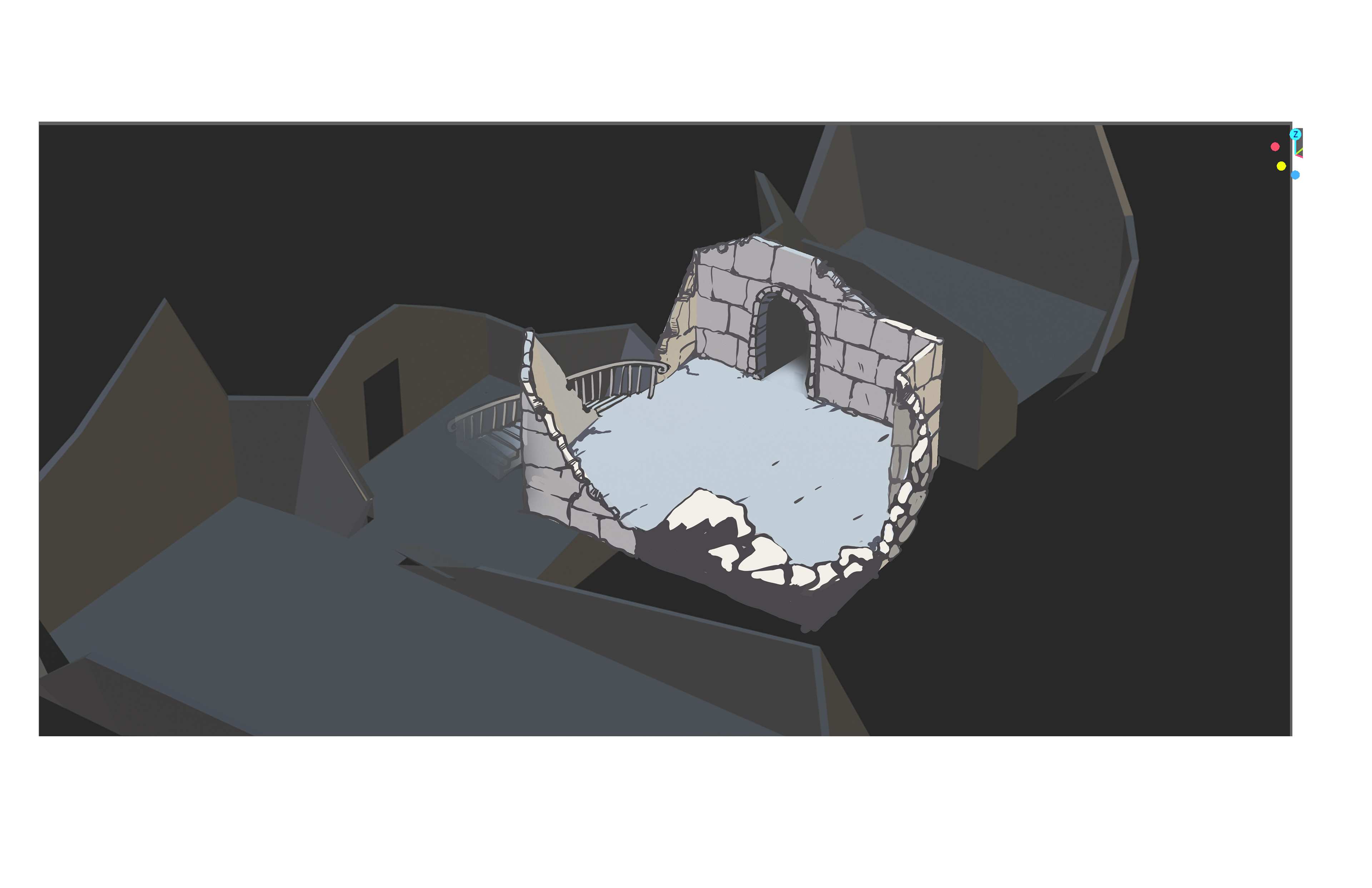

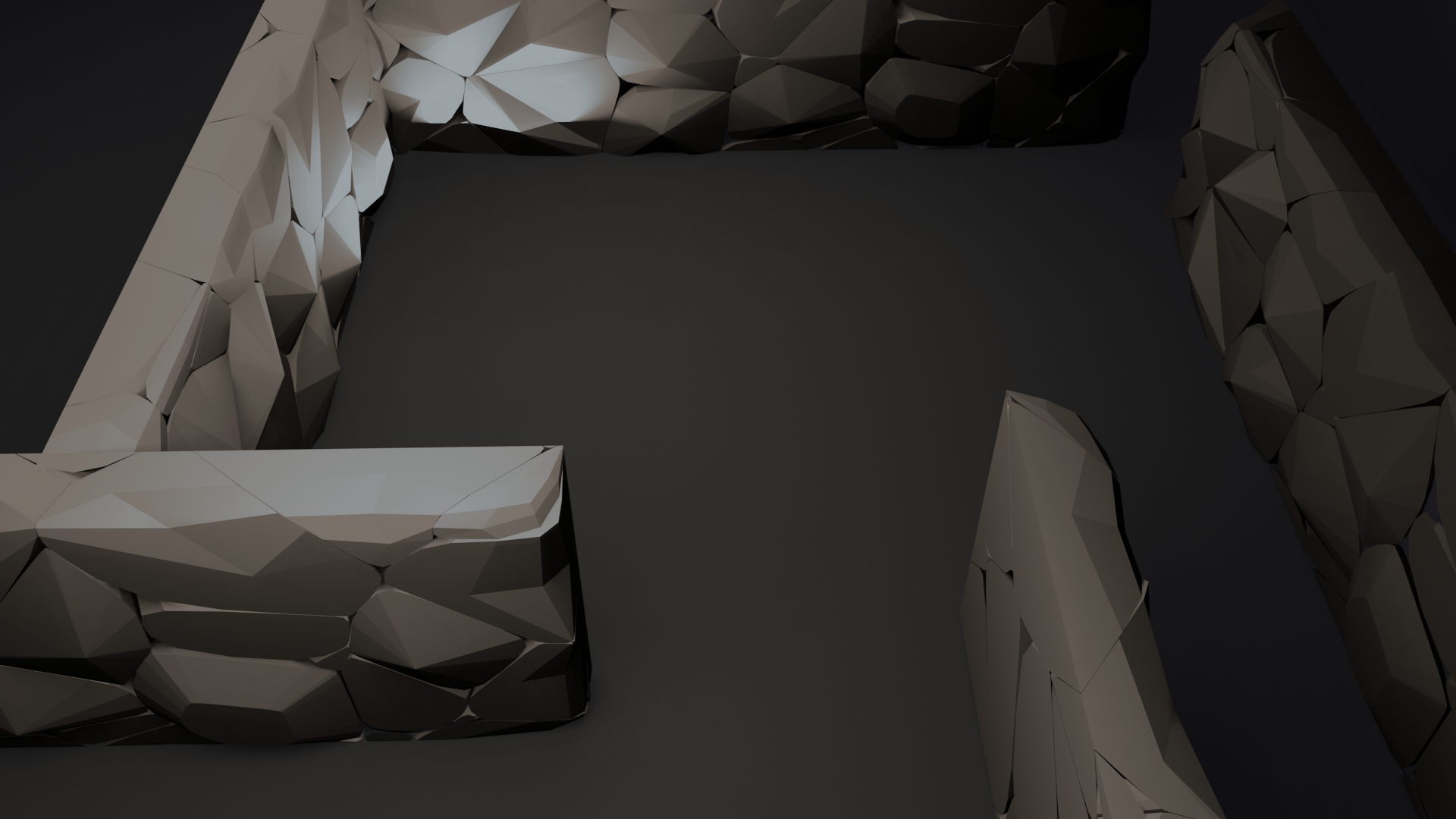
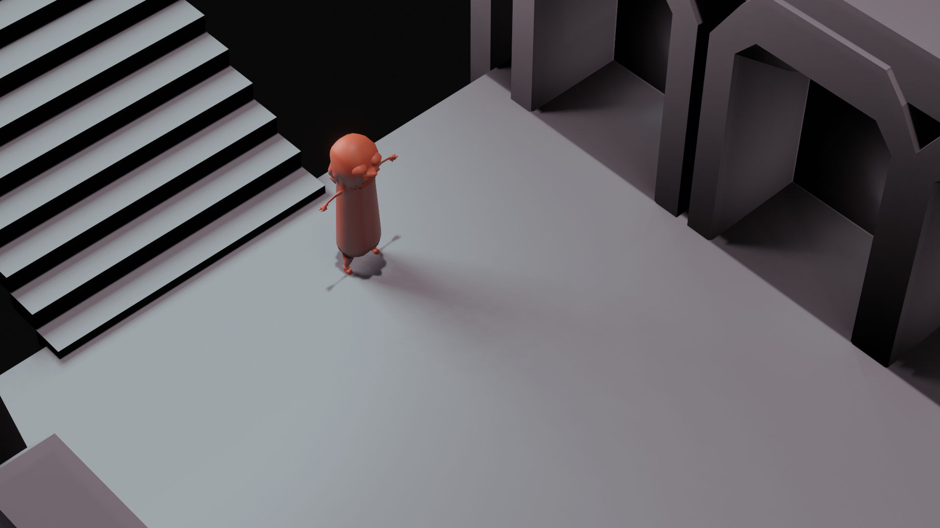
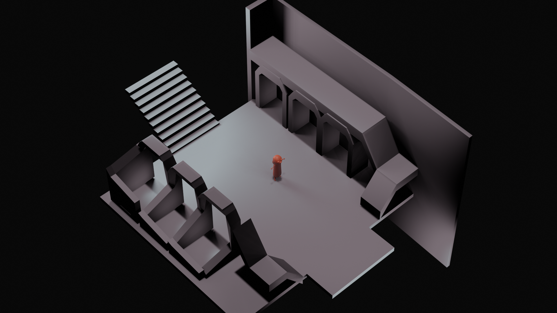

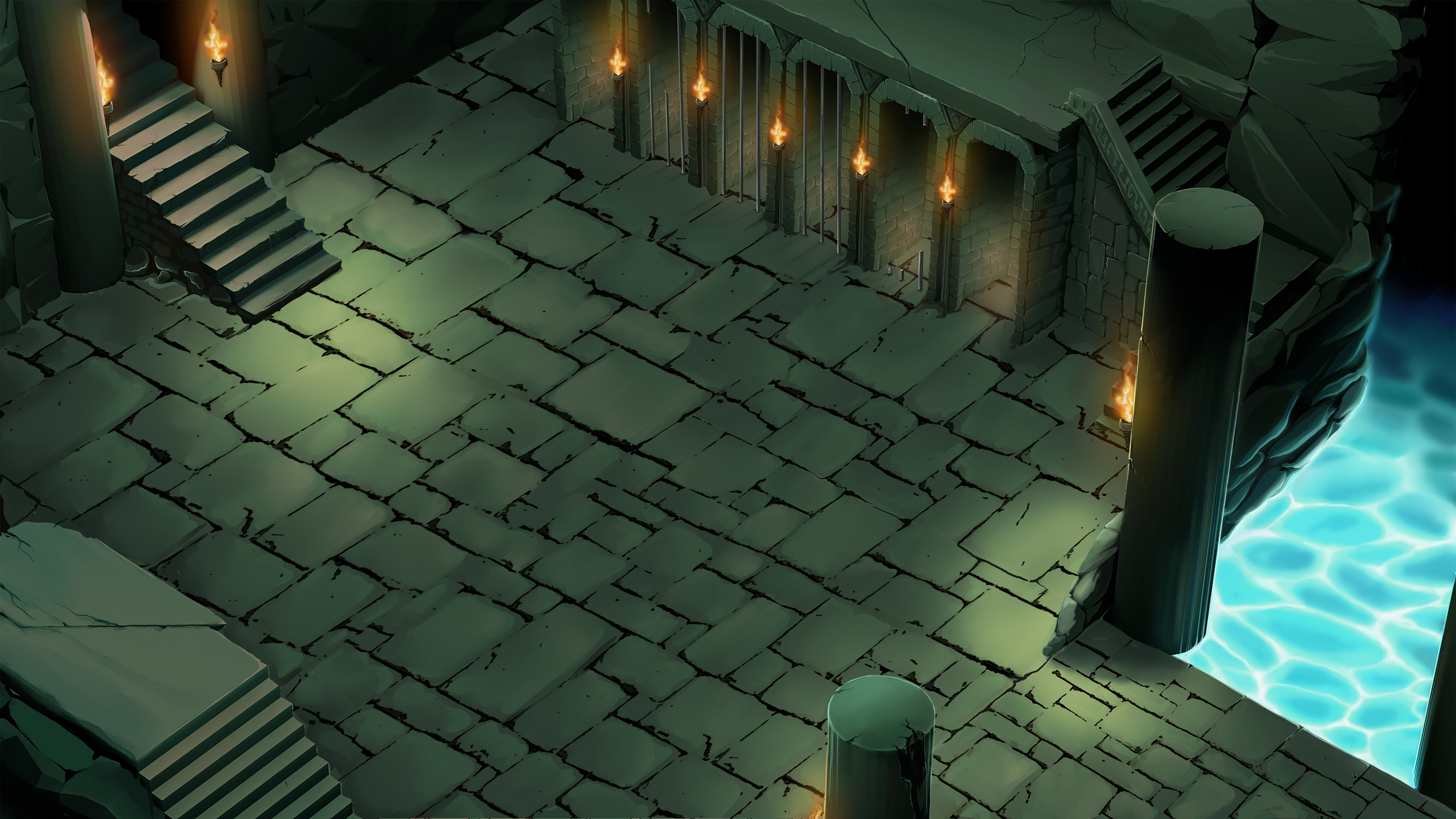
We decided to use an isometric Camera angle on a completed 3D dungeon so that 2D backgrounds could be easily tiled and we can avoid loading screens while also having it feel like a single space and not appearing to be made of tiled testures.
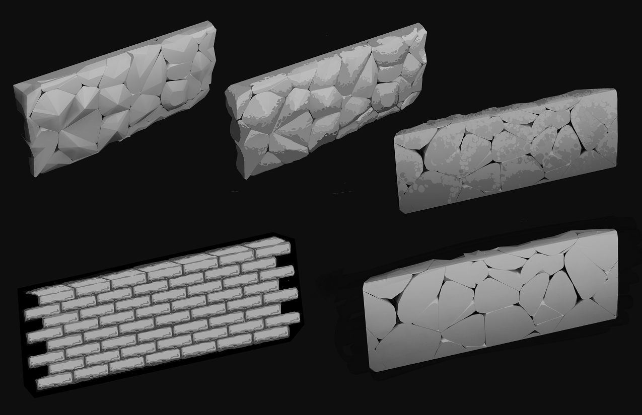
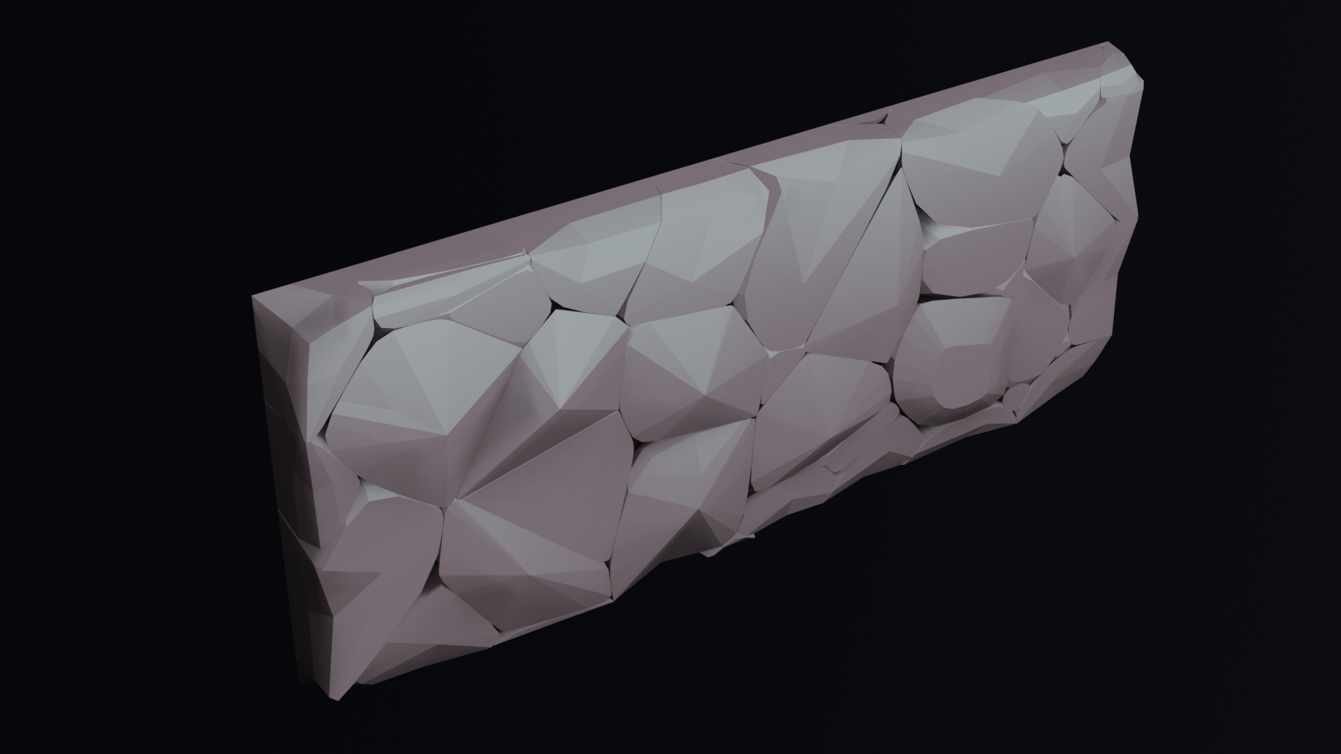
Wall Texture Designs

Zoom In Lighting Tests
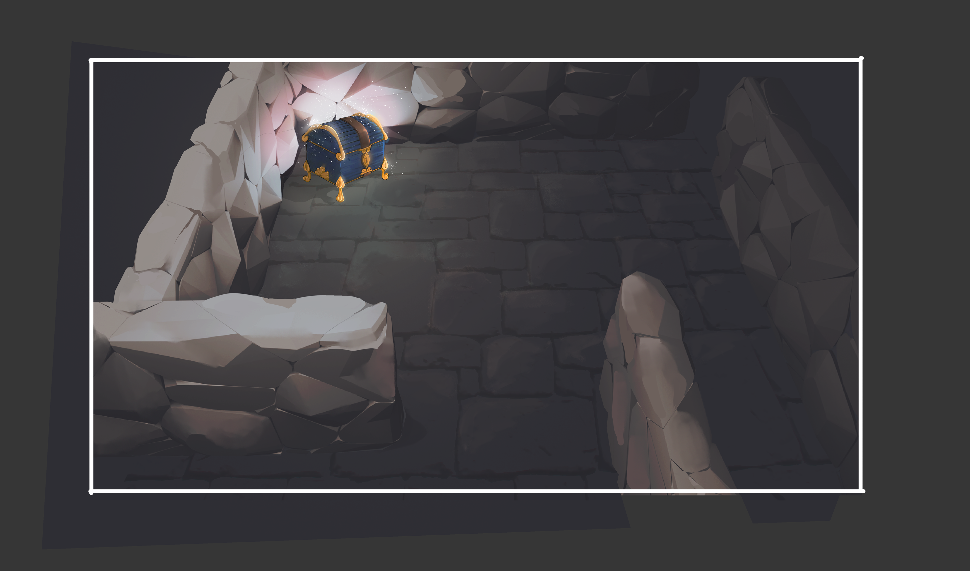
Zoom In Lighting tests
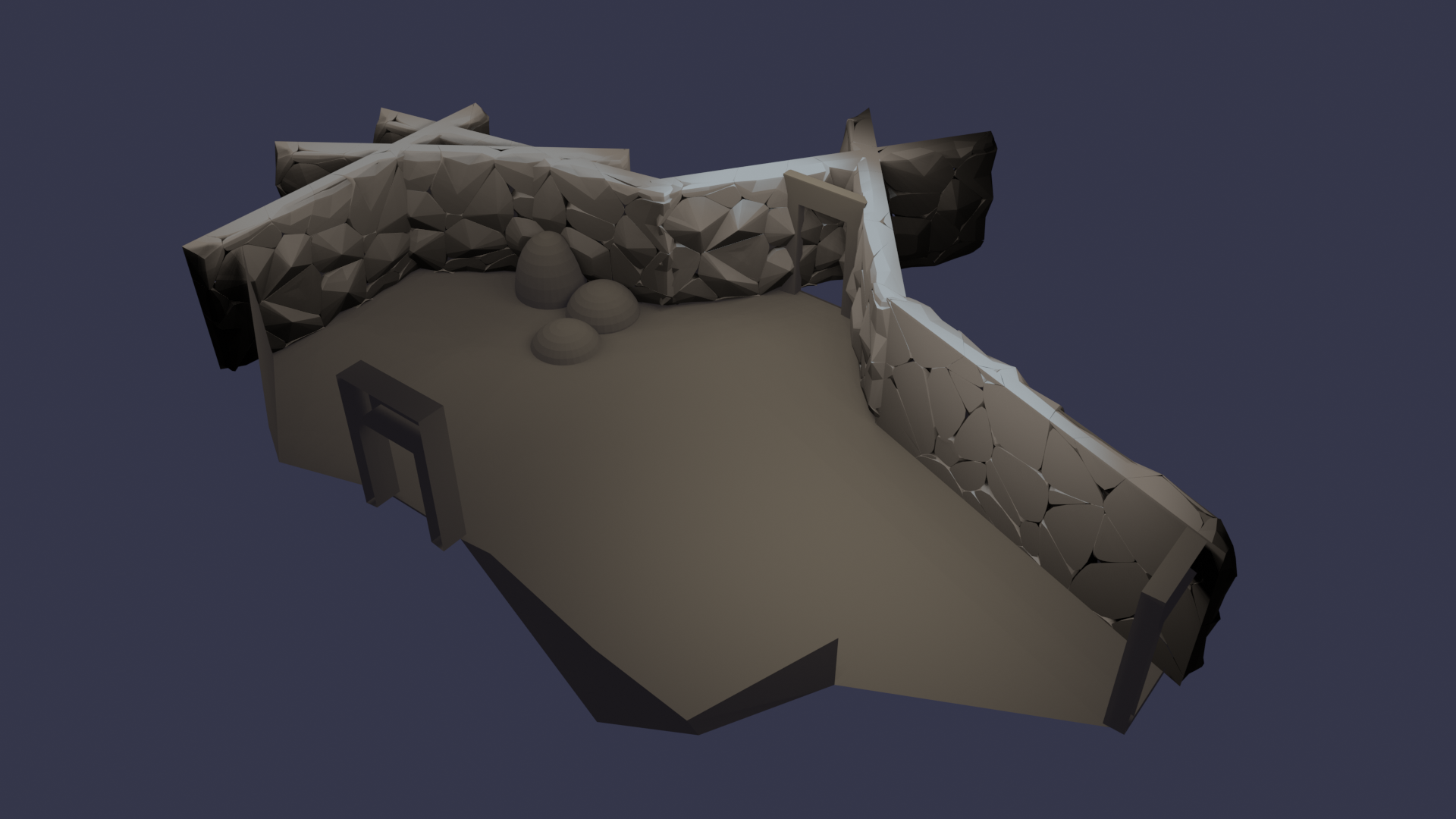
Base Model
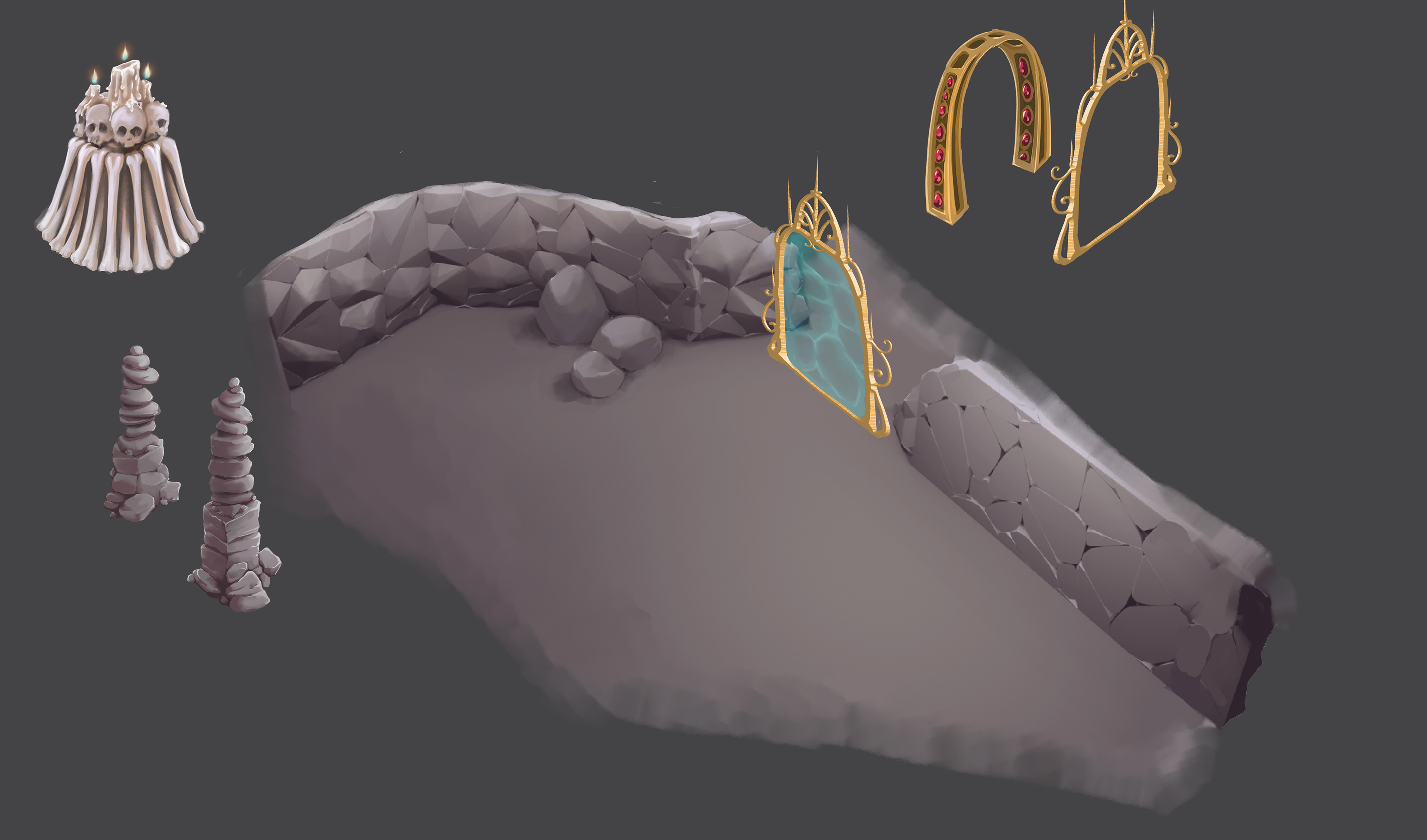
Test Paintover with Movable Assets

Final Colors
Final design and scale next to the finished paint over of a sample Background.
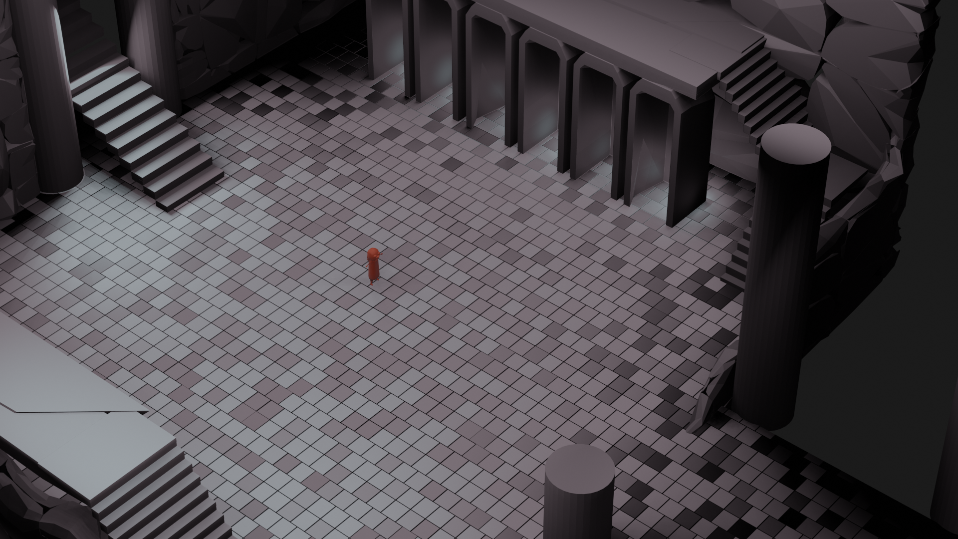
Final Scale and Layout Test
